monday may 31 2010


I've made a sketch for what the main character sees looking out her window, using what bits and pieces I already have made. It doesn't feel as strong as the first yet, but there you are, a first step.

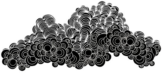
Also I'm toying around with the title and the clouds I've made.

And since a few days back I'm contemplating converting some of the designs into postcards and try to sell them, for fun, to celebrate the work I've put into them and as a little way to highlight my film. Could be fun!
wednesday may 26 2010


Making small alterations that I've been longing to do since I published this image here. No hands on top of hands, and more feathers in the background. Little things that bug me.

Now it's time to move on to the second part of the image. If I have these two images done - looking out the window and what they see from the window - and a good logo, I feel that together with the character designs I have a good visual material for an application.

The application was supposed to be handed in a month ago but I haven't heard anything from my producer. From what others tell me I gather he's taken on too much work. Hmmm.

tuesday may 25 2010


Today I've been trying to incorporate the title of the movie into the imagery. I'm still not quite sure how I'll do it, combining action and movement with clear graphics isn't all easy. I have ideas of nighttime, stars becoming the title and then shooting stars, the rays of the sun and the main characters waking up....

In my imagination it's great, in what so far exists of such a reality is more or less messy.

monday may 24 2010

Finishing the drawing of my clouds, but there's no time to scan it or fix with it.

thursday may 20 2010


Today I've made letters for the titles. The thought is to animate and integrate them into the design. I hope they are not too unreadable because I like them. They feel both graphic and jugend:y.

Now I've begun yet another insurmountable drawing of clouds, thinking the letters will disappear into the many lines of the sky.

I make myself tired and weary and excited. It feels like if the many graphic and detailed elements will work out they will add to the movie and make it pop out. And if not I've wasted a lot of time. Working out a design has elements of gambling in it. I wish I worked faster, yet I couldn't make this if I did.

wednesday may 19 2010


Today I've finally finished the background I've been drawing. The hope is that it will match the sky without competing with it, like an indoors sky, kinda. Maybe all the little lines can highlight the main characters internal confusion as well, that would be lovely.

See, before:

And after:

Here it is with a bit of shadow:

I've also been playing with fills:


And with colour:


I'm very attracted to keeping my film in black and white though.
I want it flat, just not boringly flat. Hmmm.

Right now this is my favourite, I think:

It has a bit of 20's German expressionism silent film feel to it I think, and that's never wrong in my book.

Now I'm starting to think about and tinker with the titles for the movie...

monday may 18 2010

Sitting in the sun, drawing on my background pattern. It's slow work.

wednesday may 12 2010

I keep drawing on my presentation picture and play with different ideas for a wallpaper design, that will go with but not conquer or confuse the graphic sky.

tuesday may 11 2010

I keep drawing on the presentation material. Cleaning things up and drawing each item on a separate paper. It's good efficient fun.

monday may 10 2010

I dreamt last night about my film. The movie was packed with patterns and structures and half abstract things intermingling with more depicting designs. And there was no colour. It was more to the Edward Gorey style that I originally, in 2004, was inspired by (you can see the original designs in the side bar).

This is an Edward Gorey inspired illustration I made for another project.

And watching these (especially pic 1 and 5) I start thinking...
Maybe a structured, to my mind slightly neurotic style, is the right way to go...? Mind you, I'm not saying that I think Pick me up's designs are structured and neurotic, but what I have in mind might be. Like something back to basics with where I am today's twist?

That sounds good, right?

wednesday may 5 2010


I've been working on one half of the image material that I'm making for the film application (I'll get back to you on that).

I've also started thinking about colour. One idea I have is to animate colour in abstract patterns as an overlay and keeping the characters and settings themselves in black and white. I think that could be an interesting and also expressive way to work.

Of course I've also gone through one of the gazillion doubts that seem important for the realization of a project. Do the demons look too childish? Would it be better if they were more like gigantic, slightly more abstract shadow beings?

Now I think not, but unless you try how will you know for sure?

tuesday may 4 2010

Drawing on a still from the movie where all ingredients - characters and settings - are included. I'm still doubting my design. I feel my style as an animator is too childish and that it makes my film look like it's not suited for grown ups. This is something I will have to keep thinking about, now I'm much too hungry!